Mapping fund flows to the progression of a truly global pandemic is something that EPFR – thankfully – has not had to deal with for most of its existence. But that changed with a vengeance last year, bringing with it lockdowns, stimulus checks, social distancing, closed borders and remote working.
In this new social and economic environment different dots need to be connected to unlock value. This blog will explore one topical avenue, the link between individual country’s progress vaccinating their populations against Covid-19 – with the leaders presumed to be closer to a return to economic normality – and the flows into and returns for countries.
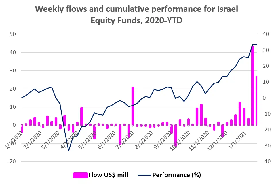
The current poster child for this thesis is Israel, which is not only the leader in the global vaccination race but offers a secondary cyber-security expertise story that is playing well given recent revelations of hacking on an international scale.
Developing a ‘jab’ factor
To develop a simple strategy that will capture the excess returns generated by high vaccination rates, we start by tapping into Our World in Data, a collaborative effort between researchers at Oxford, for vaccination data. Our World in Data provides the percentage of each country’s population who have been vaccinated, together with a time stamp.
For each country, we subset to the latest data available at 19th January 2021. We combined these with those countries for which we calculate cross-border equity fund flows using the methodology laid out in Srimurthy et. al.[1]. There are 33 such countries.
As plotting all 33 countries produces more noise than investible information, we divided them into five buckets based on the vaccinated percentage of the population of each. For each period we compute, across all the countries in each bucket, the equal-weight average of cross-border equity fund flow expressed as a percentage of assets. The chart below shows this equal-weight average, for each of the five buckets, compounded across time from the end of 2019.
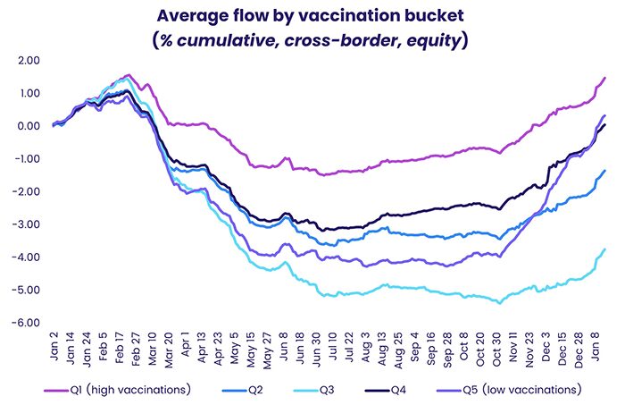
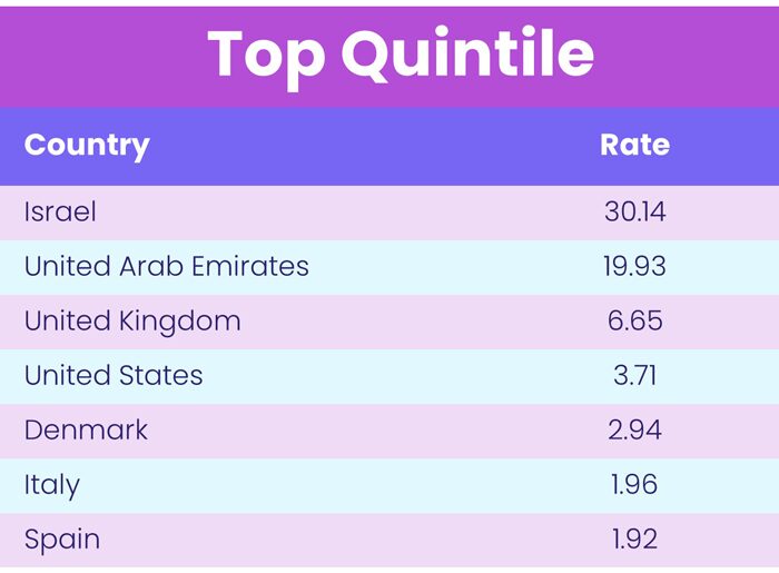
As you can see from the chart, Q1, or quintile 1, the bucket containing the countries with the highest per-capita vaccinations, has attracted the most money in 2020 and 2021. This bucket has some stars such as Israel and other developed countries such as the United States, the United Kingdom, Italy and Spain.
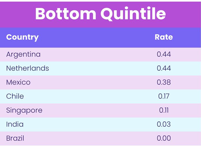
Surprisingly, quintile 5, made up of countries with the lowest vaccinations per capita, including emerging markets like India, Brazil and the Netherlands, did not suffer the most in flow terms.
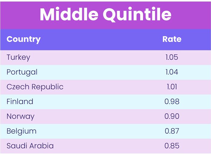
That dubious honor belongs to the middle bucket – Q3 – featuring middle-income countries such as Turkey, Portugal and the Czech Republic. They may be doing just enough in terms of vaccination that investors feel comfortable focusing on other issues and problems.
The last may be first
Flows are one thing. But which of these buckets are likely to outperform in future?
The answer, at least according to Srimurthy et. al., lies in looking at cross-border equity flow percentage over the latest four weeks (or 20 days). The table below shows, for each bucket, an equal-weight average of this metric computed across all the countries in that bucket.
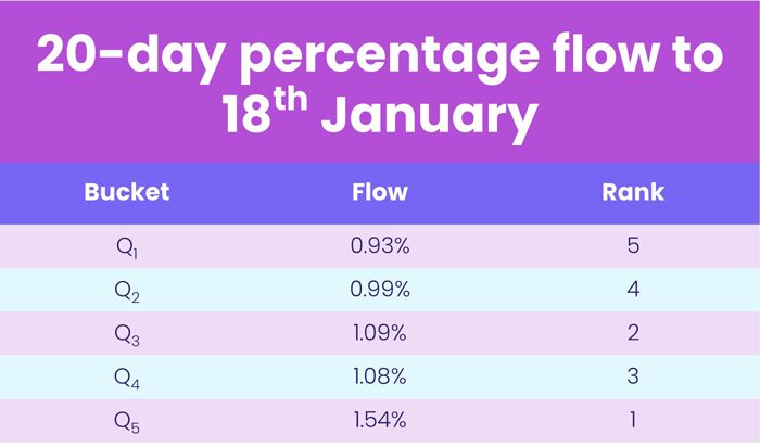
Surprisingly, this metric suggests the precise opposite of what we might have thought. Currently, the best strategy is to buy the countries that are laggards in vaccination stakes and shun the ones that have vaccinated the most.
What next?
Looking ahead, the ability of the Covid-19 to mutate may change perceptions of the best metric for gauging future performance, especially if those mutations diminish the effectiveness of the current pool of vaccines.
In the meantime, the Oxford dataset allows us to look at the vaccination rate for each country across time. Looking at the progress along that path for each country rather than, as was done here, using only the current endpoint may open the door to other quantitative strategies and models.
References
[1] Srimurthy, V. K., Shen, S., & Smalbach, M. (2018). Fund Flows as Country Allocator. The Journal of Alternative Investments, 21(3), 87-95.
Did you find this useful? Get our EPFR Insights delivered to your inbox.